
Horror Poster Textual Analysis
A Nightmare on Elm Street
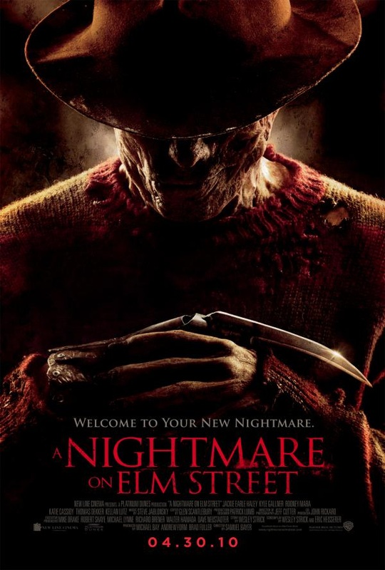
Conventions: This poster follows conventions that make it specific to the horror genre as in there are aspects of this poster that are commonly used throughout horror posters these being as horror posters and the whole horror genre is strongly associated with Goths the use of dark colours that create an unsettling feeling as you view this poster, The antagonist and a glimpse of his or her choice of weapon or method of murder but in keeping with the conventions of a horror magazine keeping the antagonists identity secrete as there is always that fear of the unknown and in this poster all of the antagonist you can really is a fairly evil smile and a single claw. This poster's use of type face also follows horror conventions as it is designed to suggest a possible theme of a horror film in this case made to look like smears of blood and a Nightmare on Elm Street is a splatter horror film.
Mood: The general tone or feel of the poster is very dark and very sinister in terms of the background it has a distinctive dark grunge splatter design which could suggests the theme of the this film. The models non verbal communication emphasizes this as there is a clear almost sneering smile upon his very disfigured face with his hands formed together positioned in front of him creating a pose of malicious anticipation, this along with the blade in place of were his finger should be interlocking to complete the pose gives this model the appearance of being rather mad. Other then the models obvious disfigurements discouraging the viewers of this poster to like looking at this model; supporting the stereotype that people who are different are shunned and unwelcome by society. The position of the models costume in terms of his hat hiding his face exaggerates the almost nasty mood of this poster as along with the sneer and the lack of eye contact of any other facial expression the viewer is automatically hostel towards the model as along with the overall mood of the monster this man looks like a nasty character. Other than the overall dull and dark colours of the poster along with the blood red and blood smear type font do effectively complete the overall mood of the poster being truly disturbed.
Font/Names: The main text used is a form of Serif Fonts to give the poster an aged feel even though the rest of the poster is a fairly modern design and quality this may be suggesting that this is a re make of the classic a Nightmare on Elm Street. The font has been specifically modified for this poster to help suggest the theme of the film as along with the main text being the red which in its self draws the attention of anyone looking at it but there are also blood smears along the text emphasizing the sinister tone of the poster. This poster is clearly trying to sell something other then star power to entice the viewers t watch this film and is instead playing on a personals natural curiosity surrounding horror films an example of this being how commonly in horror films the main protagonist curiosity leads them into danger and often death when they should have just run.
Credits: The credits on this poster do follow the normal or standard movie poster conventions being in a similar font to all other movie posters and located at the bottom of the poster under the main image and either names or title being the main text on the poster.
Tag line: The tag line on this poster "welcome to your new nightmare" is more of a very brief description of the film and therefore contrasts with other movie posters in the since they don't use this space to show the viewer of the poster other peoples praise of the film to encourage people to watch this film, the tag line itself suggests this is a film to scare people this is stated in the tag line "nightmare" the colour of the font is a dark grey talking of dreams and using dark colours emphasizes these will be dark dreams which fits with the plot of the film.
BlackSheep
Title: Black Sheep
Release: 2006
Director: Jonathan King
Production/Financing Company: The New Zealand Film Commission, Icon Film Distribution.
Main Cast: Oliver Driver, Tammy Davis, Mather Chamberlain, Tandi Wright, Danielle Mason, Nathan Meister, Peter Feeney, Eli Kent, Glenis Levestam, Nick Blake.
Film Origin: The movie is not an adaption, sequel or nor does it have its own franchise, it is simple just a movie about killer sheep.
Synopsis: In a remote part of New Zealand, secret experiments on sheep to creature the perfect sheep leads to an outbreak of Killer flesh eating sheep, yes this sounds ridiculous and that’s the point, in this Comedy Horror Henry Oldfield (Nick Fenton) returns to his family farm to sell his share to his brother (angus) only to find his brother conduction these experiments as all hell breaks loose in a “Violence of the lambs” style as sheep hunt, attack and eat humans, anyone lucky to survive a bite only slowly turns into a Were-sheep, “Bo peep never lost her sheep.”
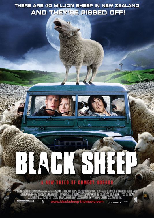
Conventions: The black sheep movie poster seems to follow the same style and look as the “scary movie” series, where the main characters are all sat down surrounded by the horrors they will face in the movies while facing the audience, unlike the “Scary movie” series the Black sheep poster is created with bright colours with the beautiful rolling green hills of New Zealand in the background contrasted to the flood of white wool and sheep all trying to get at the main characters, the poster has its credits, tag-line, main image without any of the text getting in the way of the actual image as well as the credits to the cast and crew as well as the company’s that help support the making of the movie
Mood: This movie sets a weird mood, its use of colour and choice of location at first doesn't seem in any way horror related till you start reading wanting to know why these people are trapped in a car with their dog and surrounded by an ocean of sheep as well as why the title is called black sheep, its only when you realize do you see that the bright green rolling hills in the back ground are no longer a peaceful place as well as the single sheep standing on the roof of the car howling at the moon like an old werewolf movie to hint at what a bite from these sheep can do.
Font/names: The layout of this poster clearly shows the faces of the actors as they sit in the car, the text are kept only at the top and bottom of the poster but I don’t see any names of the actors on the poster so this movie is clearly just selling the movie not the cast. The fonts used for the title look rough around the edge yet soft to symbolize the wool of the sheep while the A in black Sheep has a sheep’s head in it, the choice in font is unique to this poster but the text look to be all in block capitals and in the same font style.
Credits: This horror movie looks to be an Indie horror comedy and as such must only have so much for their budget, through careful searching I have found that they do not have any teaser posters and only have the 2 posters for their movie.
Colour: The colours here are all intense bright and colour colours as this movie is a Comedy horror, the bright green hills of New Zealand against the dark cloudy skies and the glowing full moon while they have a bright maroon colored car and an ocean of white fluffy Killer sheep.
Tagline: The Tagline in this movie is “A new Breed of Comedy horror” with relates to the story of experimenting with sheep DNA to create the perfect breed but also accidentally create a breed of man eating sheep.
Quotes: I have not been able to find a single poster of the movie Black sheep where they display the quotes of their critics.
Release: 2006
Director: Jonathan King
Production/Financing Company: The New Zealand Film Commission, Icon Film Distribution.
Main Cast: Oliver Driver, Tammy Davis, Mather Chamberlain, Tandi Wright, Danielle Mason, Nathan Meister, Peter Feeney, Eli Kent, Glenis Levestam, Nick Blake.
Film Origin: The movie is not an adaption, sequel or nor does it have its own franchise, it is simple just a movie about killer sheep.
Synopsis: In a remote part of New Zealand, secret experiments on sheep to creature the perfect sheep leads to an outbreak of Killer flesh eating sheep, yes this sounds ridiculous and that’s the point, in this Comedy Horror Henry Oldfield (Nick Fenton) returns to his family farm to sell his share to his brother (angus) only to find his brother conduction these experiments as all hell breaks loose in a “Violence of the lambs” style as sheep hunt, attack and eat humans, anyone lucky to survive a bite only slowly turns into a Were-sheep, “Bo peep never lost her sheep.”
Conventions: The black sheep movie poster seems to follow the same style and look as the “scary movie” series, where the main characters are all sat down surrounded by the horrors they will face in the movies while facing the audience, unlike the “Scary movie” series the Black sheep poster is created with bright colours with the beautiful rolling green hills of New Zealand in the background contrasted to the flood of white wool and sheep all trying to get at the main characters, the poster has its credits, tag-line, main image without any of the text getting in the way of the actual image as well as the credits to the cast and crew as well as the company’s that help support the making of the movie
Mood: This movie sets a weird mood, its use of colour and choice of location at first doesn't seem in any way horror related till you start reading wanting to know why these people are trapped in a car with their dog and surrounded by an ocean of sheep as well as why the title is called black sheep, its only when you realize do you see that the bright green rolling hills in the back ground are no longer a peaceful place as well as the single sheep standing on the roof of the car howling at the moon like an old werewolf movie to hint at what a bite from these sheep can do.
Font/names: The layout of this poster clearly shows the faces of the actors as they sit in the car, the text are kept only at the top and bottom of the poster but I don’t see any names of the actors on the poster so this movie is clearly just selling the movie not the cast. The fonts used for the title look rough around the edge yet soft to symbolize the wool of the sheep while the A in black Sheep has a sheep’s head in it, the choice in font is unique to this poster but the text look to be all in block capitals and in the same font style.
Credits: This horror movie looks to be an Indie horror comedy and as such must only have so much for their budget, through careful searching I have found that they do not have any teaser posters and only have the 2 posters for their movie.
Colour: The colours here are all intense bright and colour colours as this movie is a Comedy horror, the bright green hills of New Zealand against the dark cloudy skies and the glowing full moon while they have a bright maroon colored car and an ocean of white fluffy Killer sheep.
Tagline: The Tagline in this movie is “A new Breed of Comedy horror” with relates to the story of experimenting with sheep DNA to create the perfect breed but also accidentally create a breed of man eating sheep.
Quotes: I have not been able to find a single poster of the movie Black sheep where they display the quotes of their critics.
ZombieLand
Film Title: Zombieland
Year of release: 2009
Directors: Ruben Fleischer
Production / Financing Company: Columbia pictures
Cast:
Jesse Eisenberg as Columbus, Woody Harrelson as Tallahasse, Emma Stone as Wichita/Krista, Abigail Breslin as Little Rock, Amber Heard as 406, Bill Murray as Himself, Derek Graf as Clown Zombie, Mike White as Gas Station Owner
Distributed: Columbia pictures
Box office: $60.8 million
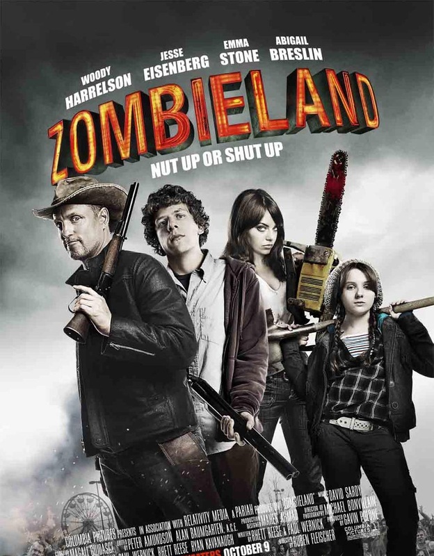
The camera angle is a wide angle shot showing all of the characters, their weapons (if they have any) allowing room for a tittle and subheading
Mood & Colour: The poster is very dull in color to represent the genre of death and zombies, and the only bright thing that they have is a title which colors look very similar to flames. This is probably because they wanted it to represent destruction and fire is a large cause and part of destruction.
The flames is confirmed to represent destruction as in the background of the poster is a fire which is giving off smoke that if looked at closely is what creates the black/ grey smoke in the background again furthering my point about flames causing destruction and the black/ grey smoke representing death, and I suspect they did this through the saying “ashes to ashes” as there are ashes in the smoke and the term is said at a funeral and has a relation to death and this can be linked to cremation which is again another relation to death. I would say the color scheme is very effective as it causes the title to stand out, however the white names clash with the lighter part of the background, but they work around the grey smoky area.
Sub Heading: A sub heading is “this place is so dead” which gives off the poster is trying to be comical and that gives an indication the move is a horror comedy, or in this case rather zombie-comedy. The phrase this place is so dead implies boring (slang) but it generally is meant to indicate the place they are is full of zombies.
Main Image: The NVC of Emma Stone is that of a female trying to be seductive which indicates she may use her charms to get what she wants and Abigail is striking a pose of someone who is casual and laid back, which can be interpreted as her making an attempt to be cool. Jesse has a blank facial expression meaning he is probably lost in deep thought which can represent his character as a deep thinker in the film through the poster and as someone that is always very cautious. Also Woody has a facial expression that indicates he is a man without fear or care and this can mean in the film his character is reckless seen in the film, through the poster. The overall mood is glum because of the background, however the characters are simply being themselves which gives it a unique feeling and in a way shows fearlessness.
Props: In addition the weapons being props also symbolize that Jessie is not a person of violence which goes back to my earlier point that he thinks most things through whilst everyone else kills first. Woody having the gun shows he is the most violent of them all but also shows he is seen as the muscle or protector of the group, and to further my point by Jesse having no weapon and again staring into space shows he is the brains of the group.
Year of release: 2009
Directors: Ruben Fleischer
Production / Financing Company: Columbia pictures
Cast:
Jesse Eisenberg as Columbus, Woody Harrelson as Tallahasse, Emma Stone as Wichita/Krista, Abigail Breslin as Little Rock, Amber Heard as 406, Bill Murray as Himself, Derek Graf as Clown Zombie, Mike White as Gas Station Owner
Distributed: Columbia pictures
Box office: $60.8 million
The camera angle is a wide angle shot showing all of the characters, their weapons (if they have any) allowing room for a tittle and subheading
Mood & Colour: The poster is very dull in color to represent the genre of death and zombies, and the only bright thing that they have is a title which colors look very similar to flames. This is probably because they wanted it to represent destruction and fire is a large cause and part of destruction.
The flames is confirmed to represent destruction as in the background of the poster is a fire which is giving off smoke that if looked at closely is what creates the black/ grey smoke in the background again furthering my point about flames causing destruction and the black/ grey smoke representing death, and I suspect they did this through the saying “ashes to ashes” as there are ashes in the smoke and the term is said at a funeral and has a relation to death and this can be linked to cremation which is again another relation to death. I would say the color scheme is very effective as it causes the title to stand out, however the white names clash with the lighter part of the background, but they work around the grey smoky area.
Sub Heading: A sub heading is “this place is so dead” which gives off the poster is trying to be comical and that gives an indication the move is a horror comedy, or in this case rather zombie-comedy. The phrase this place is so dead implies boring (slang) but it generally is meant to indicate the place they are is full of zombies.
Main Image: The NVC of Emma Stone is that of a female trying to be seductive which indicates she may use her charms to get what she wants and Abigail is striking a pose of someone who is casual and laid back, which can be interpreted as her making an attempt to be cool. Jesse has a blank facial expression meaning he is probably lost in deep thought which can represent his character as a deep thinker in the film through the poster and as someone that is always very cautious. Also Woody has a facial expression that indicates he is a man without fear or care and this can mean in the film his character is reckless seen in the film, through the poster. The overall mood is glum because of the background, however the characters are simply being themselves which gives it a unique feeling and in a way shows fearlessness.
Props: In addition the weapons being props also symbolize that Jessie is not a person of violence which goes back to my earlier point that he thinks most things through whilst everyone else kills first. Woody having the gun shows he is the most violent of them all but also shows he is seen as the muscle or protector of the group, and to further my point by Jesse having no weapon and again staring into space shows he is the brains of the group.
Friday the 13th
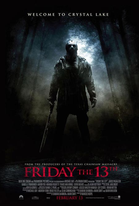
Denotation: The movie poster consists of a man wearing a mask standing with his legs opened and holding a long knife. He is wearing a shirt and a jacket, his trousers blends in with the background effect making it look black. He is also wearing gloves and standing in the middle of the forest. The long shot of the subject allows us to see all these things.
Connotation: The subject is wearing a mask which hides his identity and the long knife he is holding is going to be used for killing people. He is standing very confidently which connotes he is ready for anything that comes towards him. The mask he is wearing would also make it difficult for his victims to identify him when he is not wearing the mask, the subject is standing in the woods which connotes his victims would have nowhere to run to when he is killing them.
Mise en scene
Costume: The subject is wearing a shirt and a jacket, he is also wearing a black trousers which blends in which the background. The subject is also wearing a mask which makes him mysterious.
Props: The subject is holding a long knife and judging from his body gesture he will be killing people with his knife.
Setting: The setting of the poster is in the forest and there is some mist in the forest and a lake in front of the subject.
Lighting: The poster has a low key lighting but we can still see the subject's half face (mask), but we cannot see his feet.
NVC: With the mask on his face we can't see his NVC but judging from his body gesture he is focused on something.
|
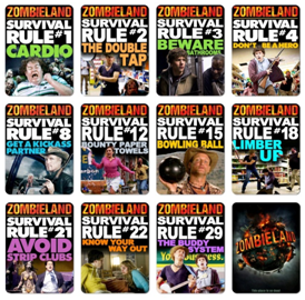
Conventions: The poster follows the main conventions as it displays zombies in the background, and it also makes a reference to death/ zombies in the title “Zombieland”.
The film is about teenager Columbus who’s in the middle of a zombie apocalypse and along his way has developed rules of survival. He is trying to get to Columbus to see his family whom he was never close to and has never had much lady luck. However on the way he meets a “badass” partner Tallahassee, and then come across Little Rock and Wichita. During his journey he demonstrates why the rules keep him safe and eventually breaks some rules, makes a family with his new found group and becomes intimate Wichita who tells him her name is Krista. -100 Words |
|
