
How Effective is the Combination of Your Main Product and Ancillary Text?
Consistency though a range of products or synergy is when there are matching characteristics specifically colours, lighting, type face's, logos, images or other iconic characteristics between a group of different products relating back to the same product. Synergy is used to add effectiveness and improve the overall delivery of a product by cross promoting that product on as many different media platforms and across as many different media texts as possible there by there product is always in your face its everywhere and reaches the maximum amount of there target audience.
Examples of existing synergy through a range of different products:

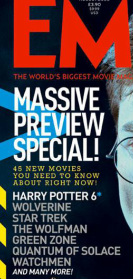
Before creating our three final products we all researched existing examples of successful horror films and how they use synergy though all of there final products and how they then used that to cross promote there film across a range of different media platforms and texts specifically maintaining consistent colors, type face, unique identifying characteristics and logo's. We found products we instantly recognized as belonging to the Saw brand as a result of consistent design including the film itself, the DVD including the design for the DVD box, the box set edition of all the films, video games, theme park rides, action figurines, iPhone apps and matching accessories.

|

|

|

|

|

|
|
|
|
The Saw franchise can be found on many different media platforms we found looking at the trailer for one of the films and the trailer for the game they are all recognizable as being part of the saw franchise though the same iconic look of jigsaw the antagonist specifically the mask, the consistent white and red mask resembling a puppet is unique to Saw so when the viewer see's it they instantly associate the product with the Saw franchise. There are high levels of consistency through the levels of lighting the grunge dark texture of the setting the graphic content and type face used for captions and credits. These high levels of consistency are what gives Saw its impact and makes it so popular and therefore effective, in terms of applying this to our three final products we also looked at the saw movie posters for inspiration in were we could add small details with the same kind of subtle hits towards the products we are trying to sell to our target audience "Lab" while still allowing our products to flow together.
Mise-en-scene is a big part of consistency throughout the Saw products, looking at the victims of the antagonist we found they are all placed in some form of deadly situation in smiler settings. Saw both follows and challenges the conventions of a horror film using dark lighting in some as this adds to the effect of a horror film on the basis of a natural human fear of the dark and not being able to see along with the contrast some of strongly lit settings which emphasizes the base line theme of the Saw films in terms of its almost like the puppet master putting on a show he wants these individuals to be put under the sort light before they die.
While researching this we thought about how we could apply this to our trailer to reproduce the same impact and delivery that saw conveys to the audience as we are trying to produce a final product emulating a professional product.
While researching this we thought about how we could apply this to our trailer to reproduce the same impact and delivery that saw conveys to the audience as we are trying to produce a final product emulating a professional product.

To do this in our trailer after shooting and arranging the shots we wanted to use on Final Cut Pro we used colour correction on the shots to change the saturation making the shots darker while leaving some other shots brighter using the contrast to give our trailer greater impact and improve on the original delivery.

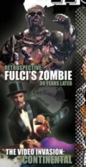
After looking at how the Saw franchise successfully used consistency throughout all products relating back to the franchise to maximize the effectiveness and delivery of the Saw as a whole as Saw is essentially what Twisted Pictures are trying to sell to there target audience, We decided to look at Resident Evil's synergy throughout there products as an existing popular franchise of zombie horror films to see what we could take from that and emulate in our work.

|
|
|
|
|
|
We looked at the scream films as they are a good example of synergy though a developing product as we can look at the similarities between the original films and the new films, specifically the difference in the tone of the films to keep up with what there target audience finds essentially scary. And how they used modern methods and new styles to do this, we also looked at how we could emulate this to our final products we found that the different or most substantial growth in the effectiveness of the saw products was there marketing which with the new technology available helped to re-kindle peoples interest in the films as there is a massive difference between the quality of the products produced to advertise there product; posters, apps, trailers, viral marketing and such and the original advertising of the saw films which would not have had the same amount of access to this technology as we have now.
Synergy through our final products:
Website
|
Poster
|
Magazine
|
Trailer
|
When we were looking at how to use synergy though all of our products one of our main focuses was on a logo and how we could incorporate this into our 3 final products while still relating to our zombie horror sub genera while still being effective as part of the design as we though a logo is something that is going to be completely unique to our group and anything with this logo on it will therefore be instantly associated with our group meaning we can brand our product on a range of different media platforms.

We decided on the bloody hand print as it has strong visual relations to the horror genera as a whole but more specifically to our horror sub genera zombies when people think of zombies they automatically associate them with lots of blood and gore going around catching and then eating the living and in choosing the hand for our logo we thought it resembled the idea of a zombie's outstretched hands trying to grab on to the victim well. While still allowing to maintains but give us some variation in how we display the design in different products to keep it interesting to the viewer we thought about how we could change the design around keeping the same colors and type face but arranging them in a different orders.

|

|
The font we used from our logo we downloaded specifically from DaFont called Damned Deluxe as it resembled our horror sub genera in that the design of the type face resembles the decaying body of a zombie adding to the overall effect of the logo and making it an iconic feature unique to our group that we could display in a number of ways cross all 3 of our final products and any additional products we design in relation to LAB.

|
Looking at different type faces we could apply to all 3 of our final products we decided and downloaded a font from www.dafont.com called TheLastSoundTrack as we thought it suited our horror sub genera in terms of the design on the text formed in a grunge distorted texture alone with the teeth outline represents the form on a zombie and the iconic characteristic of a zombie antagonism being they are reanimated corpses eating the flesh of the living.
|

|

|
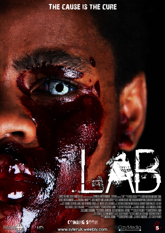
After three different mock ups of our final poster we finally decided on positioning the LAB in our chosen font to the bottom right side of the page aligned to the right as there it flowed with the poster's design while still being suttel in the design rather the jumping out as a separate section of the overall design and taking away from the effectiveness of the design as our movie poster. When adding effects on Photoshop to the font we decided to use a slight bevel/emboss to bring the font alive as it adds to the perception of this font representing zombies. We also added a drop shadow to the text to make it easily visible when we put it on the poster.
|
|
To keep the same high levels of consistency through our three final products when designing our final magazine we again positioned the LAB type face towards the bottom right of the page as this will again strongly resemble our final poster creating that desired link between the products when looked at by our target audience. To add some variation in the design of the magazine however the position of the font though in the same rough location on the page, is not positioned over the same location of our main image. For the magazine we decided to use allot more of one of our main antagonists then we did for the final poster so the text LAB in the magazine is over his hand instead.
|

|

|
For our horror teaser trailer we challenged the consistency and current standard conventions we had in place for what we wanted to do with the type face we are using for LAB. For our trailer we took away the drop shadow and the bevel effect we used for the magazine and trailer as the background design for the captions was dark enough to place the type face on top of and still be easily visible. Because we still wanted to have the same kind of delivery of the title of our product for the captions we added a distortion effect to the type face jumps around the screen. In terms of positioning of the text for the trailer we decided to have the text more centered as a way to sum up the three final products together its the first thing you see on the poster and the last thing you see on the trailer.
|
REC 1
|
REC 2
|
REC 3
|
When designing our final products we looked closely at existing successful products we thought were the most effective at selling to there target audience, specifically products like REC as they are all zombie horror films based on the same horror sub genre as our product. When looking at the REC movie posters we thought one of the biggest contributing factors to the effectiveness of the posters as part of there final product is the high levels of consistency in the layout of the posters with the main image aligned to the left the position and type face of the font as well as the unique design of the type face gives the posters some variation in the actual design keeping them current and preventing the target audience loosing interest in the product while still allowing the posters to flow as products advertising for the same brand. As we are trying to emulate professional standard products we applied several of these factors in our final poster.

For our poster we followed most the same conventions we found to be effective in the REC horror posters. When applying these conventions to our final poster the layout of the REC posters had the biggest impact on our work in terms of the positioning of the different elements such as aligning our main image to the left hand side of the page with half of the models face going off the page as we found this creates a sense of mystery when looking at the poster leaving the viewer wondering what's on the other half of the models face there by encouraging our target audience to want to see the film to satisfy there curiosity, we did this as it was useful to our design in a number of ways firstly it provided us with another way to sell our final product to our target audience playing on there own curiosity and secondly using our target audience themselves to sell our final product or at lest encourage them to want to go and see the film we found to add greatly to the overall effectiveness of our final products by looking at existing exsamples to films that already do so like the REC trilogy and there popularity.
To again add to the effectiveness of our final products rather then just having the models face going across half the poster with no disenable theme or indication of what kind of film this is we used the REC 2 poster among others and again followed the same or similer conventions they used when it came to the design of the model being the main aspect of the poster. We did this by adding costume and make up to the model specifically the fake blood around the models face as we found this the most effective method of stating what type of film this was going to be, We then edited the tone, contrast and hue of the image to give it a darker finish to again indicating the tone of the film, and finally extensive editing of the models eye to produce the final finish of the product.
To again add to the effectiveness of our final products rather then just having the models face going across half the poster with no disenable theme or indication of what kind of film this is we used the REC 2 poster among others and again followed the same or similer conventions they used when it came to the design of the model being the main aspect of the poster. We did this by adding costume and make up to the model specifically the fake blood around the models face as we found this the most effective method of stating what type of film this was going to be, We then edited the tone, contrast and hue of the image to give it a darker finish to again indicating the tone of the film, and finally extensive editing of the models eye to produce the final finish of the product.

To add to the design of both our magazine and poster we found that overlaying this grunge texture and increasing or decreasing the opacity brought out the images on both final products giving them a distinctive horror finish conveying the appropriate tone we desired to our target audience. We also found this effect greatly increased the presentation of our final products as it allowed us another level of the design to manipulate to our required specifications other then the colour scheme, fonts and lay out although all being important elements to a successful and effective product, this element of the design allowed us to edit the mise-en-scene of the final products specifically the appearance of lighting, which we found to be very useful in editing the different levels to make our final products more appealing to our target audience.
Before: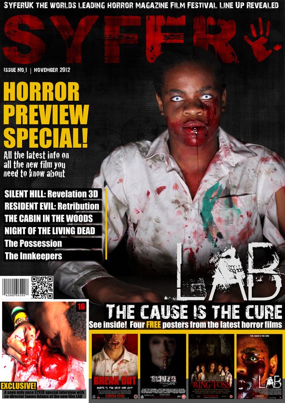
|
After:
|
|
|
In terms of how effective was this in producing our ancillary texts we all agreed that the designs after seeing them with this effect lacked emphasis and delivery without them and looked plain. Thinking of what these products would be like as rreal professional products and specificly the magazine without this effect we though our target audience would look by our product if it were on a shelf amonge other similer products so we decided to add the effect to both our magazine as it made the design stand out and is very eye catching so would be more likely to intrest our target audience. And to our final poster to maintain consistency through the products making them still easily recognisable as belonging to the same brand.
Poster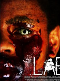
|
To keep synergy through our final products, we used the same model used as one of the main antagonists in the film to advertise our film across all of our final products. We found this was the most direct and therefor effective means to convey that all of our final products are linked to the same film to our target audience as this is a consistent visual and obvious confirmation rather then leaving it for the target audience to infer. |
Magazine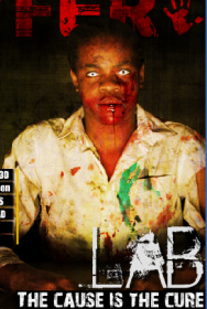
|
Trailer

Looking at how we could effectively use the design of all of our final products individually to successfully advertise our film as a whole we had to find ways of ensuring that they were all still recognizable even as different media texts to belonging the LAB brand. We decided that the most effective way short of stating it on all of the final products was to keep a consistent model in both costume and design in our different media texts to create that instant association.
|
|
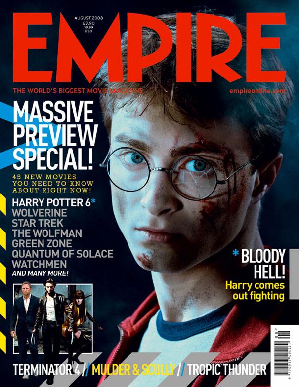
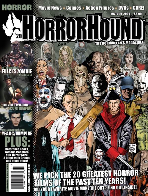
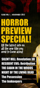
These are some of the examples of existing media texts we looked at for inspiration of how we would format our designs to be as effective as these already popular magazines, we were specifically looking at the forms and conventions they put in place and how effective they were in the final designs and how effective they would be for our zombie horror magazine. Looking at how we could follow or challenge these conventions to meet somewhere in the middle and produce a final magazine our target audience would like. We found the layout from the empire magazine allowed for the best delivery of information however the design and theme of the horror hound magazine would produce the best design format for us to work with.

|

|
An important convention in any magazine is the left third of the magazine this is the section displayed when a group of magazine are stacked on a stand in a shop waiting to be sold.
The left third of our final design follows the layout of the empire magazine and the conventions we found to be effective from that in our design as they allowed us to clearly convey information that may be of interest to our target audience or people whom are just fans of the mentioned films who may not be a fan or interested in the main article but would still get a copy of the issue to see what information about the mentioned films was available giving us a even wider range of customers. And still flow with the design and tone of the magazine without taking away from the overall design. What we found most useful about following this convention was it meant we kept high levels of consistency throughout our final products. |

|

|
|
Another common convention we found to be effective and so emulated in our final design for the magazine is the use of secondary or seprate images other then the main image used to draw in the viewers attention as this increases the chances of producing a sale as even if the viewer is not interested in the main article of the magazine they may be tempted or drawn to bye it to see what information is available about the other articles displayed on the front cover.
Another use and more specifically in terms of the use of the secondary image displayed on the cover of our magazine is to further advertise the product displayed by the main image showing a little more of whats available with this product increases the viewers natural curiosity using the same method as a teaser trailer enabling us to grab our target audience attention above other similar products. |

A convention we challenged we used to modernize our final product as we have found that one of the most important elements to produce an effective media text in today's modern world is to keep products current with both the fashion and design that is currently popular with the target audience and to keep up with the growth of technology. We included a Q.R scanning code in the design of our final magazine unlike both the empire or horror hound magazine as using a smart phone or other such hand held technologies to scan a Q.R code is the fastest way for the scanner to gather more information about the subject the code relates to, meaning our target audience interested in our product can quickly access our products key information to encourage them to go and see our film. We found this even as such a small part of the final design to be one of the most effective elements we included and received good feedback about how useful this aspect of the design was.

|
|
To keep with the conventions and consistency of the other products we used the same shots on the final magazine and poster as we did on the final trailer as this creates the link between the products and makes them an effective combination between magazine, poster and trailer and links them all to the same brand making it instantly recognizable to the target audience.
Promotion of our film

When thinking about how we could use methods already in place in the media industry to promote authentic media texts, as our overall aim is to re-produce an authentic array of final products we thought about how we the public and therefore the target audience go about selecting and then viewing existing films. The main interface between our target audience the youth of our generation and media is the internet, when looking to go and see a film you log on to the webpage or download the app of the cinema in question, look up the film schedule and book a ticket online.

|

|

|
An important element to the effectiveness and there for success of a film is the advertising campaign, we looked at how we; emulating a professional product, could promote our product to the public and came up with these different design ideas. We thought specifically of how we could reach the public and so decided to promote our film out in the general public on trains, buses, bill boards, flyers and other such different platforms we could mount a design on .
|
Current Technology
When thinking about how the specific age rage our final product is target at and in fact cast in we thought about the most effective or common interface between teenagers and the variety of different products and the advertisement of those same products. From our own experience and some research among the people of our targeted audience we found that the internet and other technologies connected to the internet, We thought about how professional products use this to get there product out to the maximum amount of people and then how we trying to emulate professional products could take there example and apply it to our final products.

An example of the user interface between our target audience and the internet is the use of portable media technologies such as smart phones. As we are trying to produce an effective and professional array of final products we thought of how we would display our product on these technologies to advertise to our target audience. Here is an example of how a possible mobile webpage for our film would appear on the Blackberry smart phones.

|

Again with the Proliferation of Hardware and the continued development of new technologies modern films are becoming 360 degree products meaning they are products across a range of all the different media platforms a now common use of this new technology is now films regularly come with an App which if interested in, the targeted audience could download to there smart phones to gather more information play games or watch trailers to help convince them to go and see the film. Film makers do this to maximize there effectiveness of there product by keeping it current and maximizing the rage of people there film reaches.
This is an example of the app we would develop for our film using this same method to turn our film into a 360 degree product and ensuring we cross promote our film on a variety of different media platforms meaning our product reaches as many of our target audience as possible. |
We found along the length of this project that one of most important aspects of an effective and therefor successful film is to keep there product current in terms of the current technology available as with the continuing growth of technology our target audience is updating there technology meaning any previous advertising methods are redundant meaning it is not reaching there target audience.
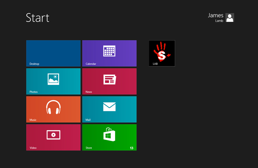
Here is an example of how we would if making a real product use current technology to advertise our film using both the drive of our marketing campaign to reach our target audience but also cross promoting our product with the latest technology going global such as the new windows 8 operating system linking or associating our product with a product of already global knowledge and excitement, this would maximize the effectiveness of our products in terms of advertising our product as it would be reaching our target audience on a global scale.
Here is an example of how we would if making a real product use current technology to advertise our film using both the drive of our marketing campaign to reach our target audience but also cross promoting our product with the latest technology going global such as the new windows 8 operating system linking or associating our product with a product of already global knowledge and excitement, this would maximize the effectiveness of our products in terms of advertising our product as it would be reaching our target audience on a global scale.
Social Networking
|
An important part of the distribution of a film and other media texts relating to that film is the use of current technology and social networking; being interconnected online, is a relatively new form of online technology. When a film is released it comes along with a Twitter page, when you see the trailer you go and follow the twitter page to get more information about the film and to connect with other like minded people interested in the film were you can discuss the different elements of what you like and what your not to sure about. Film makers use these sites to spread the word about there film among there target audience as word of mouth is one of the most important advertising elements to the success of a film.
|

|

|
There are different social networking options available to be chosen from; given on the users preference. A films marketing campaign will have so association of area on these different social networking sites to promote there film, on Facebook this takes the form of a Facebook page you go and "Like" after seeing the trailer, poster or magazine were there is more information about the film available. Film makers use these pages to try and sell there product using or naming famous actors staring in there films promoting there star power. As we are trying to create a professional product we also designed these pages for potential personas interested in our product can find more information.
|

|

Products relating to our film
More and more films are extending there product across more then that single media platform they are becoming what's known as 360 degree products this means that when a film is released a range of other products across all different media platforms are released along side it to maximize the effectiveness of there film by getting it to as many of there target audience as possible and keeping there products current. Instead of just a film we though about how we could use existing partnerships between production company's and commercial products with our product and came up with a number of examples of how we would do this for different products as shown below:


|
Using a laser cutter we printed out zombie figures and the stands for them to sit in in a range of different colours we could use as playing pieces for our game. When designing these we looked specifically at the figure of a zombie when people think of zombies what is going to be the first image that comes to mind when we decided on the final design as it looked the most realistic of the design options we had available. We found these to both be effective for the use of our board game and when out of the stands possible iconic products relating to our brand identity in the use of items such as key rings. Serving multiple functions as people with the board game can already have there playing peaces and allowing us to advertise our product on a different platform across a wider range of different media texts.
|
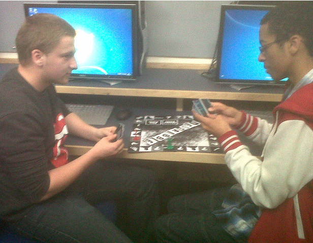
The use of a board game to advertise our product reaches our target audience and is available to possible customers who might not have the same level of internet access of technology as the rest of our target audience insuring we are reaching the maximum of our target audience and making our product fully inclusive.

This is an example of what a possible design of the DVD cover for our film would look like, we would distribute our product across a range of different media platforms; DVD, Blu-Ray, Digital Download. Focusing on the main element of our product being the film and to ensure everyone in our targeted audience can gain access to the film.

|
Following the design for the standard DVD edition of our film, this is what we would use for the design cover of the Blu-Ray DVD special edition cover, again using the same high levels of consistency to maintain consistency throughout our media texts as this gives our film the same level of impact and the same delivery throughout all of our products. We found earlier with our 3 main final peace that this high level of consistency has high levels of effectiveness to the success of the design meaning that our target audience found that the use of the same main image or model was ideal for them and others they would introduce our product to as it made it easy to link the different media products to our brand.
|

|
When looking at modern ways production company's sell there products to there target audience we found that a big interface between our target audiences general age and different media platforms are video games. More and more films are released as games as it adds to the overall experience of the film as it gives the player the chance to be part of the film. To emulate this we throughout about how we would turn our product into a video game for the xbox 360 as shown with other successful films having different media texts relating to your product adds to the effectiveness of the marketing campaign and therefore to the overall effectiveness of the product.
|
