
Horror Magazine Textual Analysis
HorrorHound
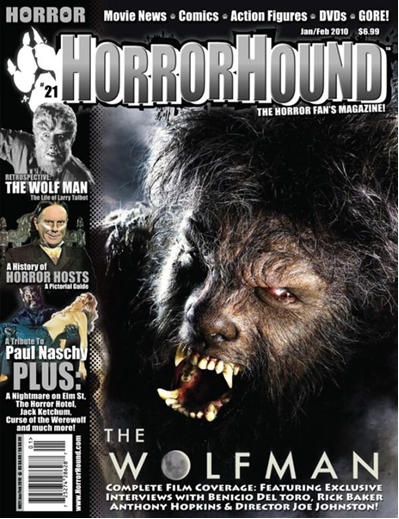
Masthead: The Masthead 'HorrorHound' is displayed in the common location following the standard conventions for a magazine the top of the magazines front cover. The type face used is all bold capital letters making this bit of text not only the biggest and boldest text on the front cover but also the first thing to draw the viewers gaze. The name of the magazine itself suggests the content as a Hound is most commonly thought of as some form of dog or beast in this case the best being a werewolf, the mast heads colour reinforces this idea of the magazine being about werewolf's as the connations of silver again around 'hound' are referring to the widely known supposed method of killing a werewolf being you must shoot it with a silver bullet, also the white outline around the font is used to reinforce the suggestion of this magazines content as again the connections of white in this case are referring to the moon as many of the myths surrounding the transformation of a human into a werewolf tell of this event occurring only on the night of a full moon.
Dateline: The date line shows not unlike the werewolf the issue is about, this magazine is produced once every couple of months 'Jan/ Feb 2010' the connotations of this being either this is to emphasize the topic of HorrorHound being about mythical monsters appearing every so often along with the full moon. Or that there is not enough content producible on werewolf's in the horror genre to publish an issue every week or month. The dateline on this magazine also includes the magazines price '£6.99' this is a very steep price for a magazine reinforcing that this magazine isn't able to produce an issue more regularly and there for dose not sell as well or as often as some of the other horror magazine competitors so needs to charge more for the issues they do release.
Main Image: This issue of HorrorHound's main image is the single biggest image on the front cover telling the viewer that this is the most important thing about the magazine, the image of a werewolf is taking up most of the front cover firstly confirming that this magazine is indeed about werewolf's as the connotations of the Masthead suggest however this main image challenges to standard convention of a magazines main image as the model isn't making eye contact with the viewers suggesting that yes while this is a striking image that will stand out to passers by looking at it among other magazines on the shelves of stores and shops , unlike the other film, music or any other magazines with the model positioned to be in eye contact with the viewers; in an attempt to personalize the model with the viewer creating that connection that encourages them to buy the magazine. Viewers of HorrorHound are more observing this model of this horror antagonist then connecting with it creating the desired sense of misgivings and even of fear that should be associated with a werewolf and a Horror magazine.
Main Cover Line: The main cover line 'The Wolfman' refers to the magazines exclusive content in the form of interviews with director Joe Johnston about his latest horror film; of which the model on the front cover is the main antagonist. And other starts of the film.
Cover-Lines: All the cover lines are in keeping with the general Horror theme of the magazine and the silver all capital letter type face of the mast head which has possibly been edited specifically for the content about The Wolfman in this issue to firstly show other content of the magazine to any viewers who may be interested in the content but not a fan of the main story but secondly not to distract away from the main story as this will be the main selling point of this issue.
Left Third: The left third of this issue is packed with the other images and cover lines to the content of HorrorHound so while sitting stacked on a shelf with the other various magazines any viewer will see the content of this issue to grab any target audience's attention before they even pick it up and see the rest of the font cover and the main feature of the magazine. However again this magazine challenges the normal conventions of most magazines as the Masthead or begging of the Masthead that instantly identifies the magazine to the viewer is not shown in the left third meaning people whom are fans and by this magazine may overlook it on a shelf of other magazines, it has been replaced with a paw locating the issue number.
Bar Code: Standard bar code used by retailers for scanning for price and keeping record of stock
Selling Line: The selling line in case the viewer was in any doubt of the theme of this magazine states clearly 'Horror' and then goes on to state or give a very brief summary of the overall content of the magazine telling the viewer what they can look forward to finding inside the issue.
Total Film

Masthead/Logo: The masthead is placed behind the main image and is “Total Film” a well known website and magazine for the best movies to watch in cinema’s, at home or just knowledge on the films you love.
Dateline: The date line is positioned on top of the large Letter M with the issue number and price, Reading “NOVEMBER 2009 ISSUE 160 £3.99”
Main Image: The main image is the sexy female celebrity “Mega fox” who plays the antagonist of the movie “Jennifer’s Body” she is dressed in her Cheerleader outfit as seen on the movie as well as her “BFF” pendant around her neck, her hair is styled to stay out of her face and easily show her as the celebrity she is while at the same time standing in a seductive pose looking directly at the reader but it still keeps a tiny element of horror with the blood soaked right hand as well as the blood splatter by her left foot, this will cause readers who have not seen the movie to be interested and want to know more to eventually seeing the movie either at the cinema or buying the DVD.
Model Credit/Main Cover Line: “I don’t want to be the Jar Jar Binks of a movie…” This is the main cover-line for the article on “Jennifer’s body” more is explained on page number 6.
Cover Lines: The other cover lines on the magazine cover speak about other movies as well particularly interviews with celebrity’s but still highlighting Page 6 naming the person on the cover as “THE DEADLY MEGAN FOX” then finally the “plus” section is the regular articles printed in each issue.
Left Third: The left third contains an recognizable logo of Total film, the large letter F with the word “Total” printed in the F as well as a large cover line saying “The future 100” placed inside an arrow that points to Megan fox and a smaller cover line under the arrow saying “EVERYTHING THAT MATTERS FOR THE NEXT 12 MONTHS” as well as a the sight of Megan fox’s bloody right hand that will attract readers to find out what’s going on in this months issue of Total Film.
Bar Code: The bar code is a standard bar code for the retailers use only.
Selling Line: There sell line is placed in the very top left corner as part of the left third reading “OUR BIGGEST PREVIEW EVER!” this shows readers that this months issues has more content than any other issue before.
HorrorHound
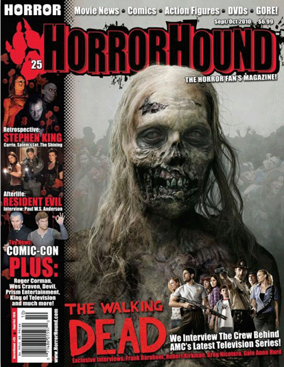
Denotation: The horror magazine consists of a coloured photograph of a zombie woman who was once dead. A medium close up shows her head, shoulders and chest. In the background is a picture other zombies and also the picture is faded. The font colours are red, black and white but amongst all the colours red stands out. The cover lines are on the left side of the magazine, the cover lines are about other interesting things in the magazine for example an advert on Resident Evil. The logo of the magazine is not only the masthead but also the paw of a hound on the left side of the magazine merging into the masthead. There is a bar code visible on the lower left side of the magazine also the website of the magazine is also on the lower left side. The main cover line is at the bottom of the magazine which reads "The walking dead".
Connotation: The subject has no mouth and her body looks rotten making her look like a rotten dead body, she also has no clothes on and she is almost bald. Her teeth are rotten and her gums are black all these connotes she's a dead woman. The magazine uses red and black in the masthead and the cover lines, red connotes blood and black connotes darkness in the zombies.
Mise En Scene
Costume: The main image of the woman has no clothes on and her skin looks black and burnt. The first cover line on the left side of the magazine has picture from the movie "carrie", the girl is covered in blood.
Props: The main image of the dead woman is has no prop, but the cover lines on the left side of the magazine has a medium long shot of two women and a man in the middle, they are holding a touch light and guns ready to fire. The picture on the bottom right side of the magazine has group of people and there is a sheriff pointing a gun at something and another man standing next to him also holding a gun .
Setting: The setting is hard to define but the setting could be at a grave yard when all the dead people have been awaken and she is leading them.
Lighting: The lighting is low key which allows us to see the main image but her background is faded.
NVC: The subject's NVC is hard to explain but she is showing no emotions and zombies have no emotions.
The Walking Dead
Film Title: The walking dead
Year of Release: 2010
Directors: Robert Kirkman, Tony Moore, and Charlie Adlard.
Production & Financing Company's: AMC Studios, Circle of Confusion, Darkwood Productions, Valhalla Motion Pictures
Cast:
Andrew Lincoln as Rick Grimes, Sarah Wayne Callies as Lori Grimes, Laurie Holden as Andrea,
Steven Yeun as Glenn, Chandler Riggs as Carl Grimes, Norman Reedus as Daryl Dixon, Jon Bernthal as Shane Walsh,Jeffrey DeMunn as Dale Horvath, Melissa McBride as Carol Peletier, IronE Singleton as Theodore "T-Dog" Douglas, Lauren Cohan as Maggie Greene, Scott Wilson as Hershel Greene, Emily Kinney as Beth Greene, Jane McNeill as Patricia, James McCune as Jimmy, Madison Lintz as Sophia Peletier, Emma Bell as Amy, Jeryl Prescott as Jacqui, Michael Zegen as Randall, Adam Minarovich as Ed Peletier, Andrew Rothenberg as Jim, Juan Gabriel Pareja as Morales, Michael Rooker
Distributed: AMC, Fox International Channels
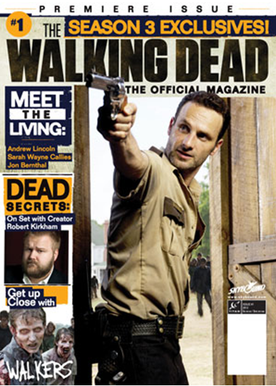
Title: The name of the magazine is Premiere Issue,
Main Image: The main image is Rick Grimes holding a gun entering what looks to be a barn in his sheriff uniform. The way he is holding the gun implies he is ready to shoot and the angle he is holding it is high which reminds the audience that to kill a zombie it must be shot in the head.
Main Cover Line: Their main cover line is “season 3 exclusive” with#1 in the top right corner. Also their other cover line “meet the living dead” uses the word meet which implies interviews but at the same time relates back to zombies as they eat meat/ people and
This magazine has no bar code The main marketing point are those who have watched the first two series of the magazine and are looking to give sneak previews and little teasers of the new series away. This can be through pictures, links to clips and interviews.
Text/Colour: The text used by the magazine is a white text and orange text for the important parts they want to stand out.
Year of Release: 2010
Directors: Robert Kirkman, Tony Moore, and Charlie Adlard.
Production & Financing Company's: AMC Studios, Circle of Confusion, Darkwood Productions, Valhalla Motion Pictures
Cast:
Andrew Lincoln as Rick Grimes, Sarah Wayne Callies as Lori Grimes, Laurie Holden as Andrea,
Steven Yeun as Glenn, Chandler Riggs as Carl Grimes, Norman Reedus as Daryl Dixon, Jon Bernthal as Shane Walsh,Jeffrey DeMunn as Dale Horvath, Melissa McBride as Carol Peletier, IronE Singleton as Theodore "T-Dog" Douglas, Lauren Cohan as Maggie Greene, Scott Wilson as Hershel Greene, Emily Kinney as Beth Greene, Jane McNeill as Patricia, James McCune as Jimmy, Madison Lintz as Sophia Peletier, Emma Bell as Amy, Jeryl Prescott as Jacqui, Michael Zegen as Randall, Adam Minarovich as Ed Peletier, Andrew Rothenberg as Jim, Juan Gabriel Pareja as Morales, Michael Rooker
Distributed: AMC, Fox International Channels
Title: The name of the magazine is Premiere Issue,
Main Image: The main image is Rick Grimes holding a gun entering what looks to be a barn in his sheriff uniform. The way he is holding the gun implies he is ready to shoot and the angle he is holding it is high which reminds the audience that to kill a zombie it must be shot in the head.
Main Cover Line: Their main cover line is “season 3 exclusive” with#1 in the top right corner. Also their other cover line “meet the living dead” uses the word meet which implies interviews but at the same time relates back to zombies as they eat meat/ people and
This magazine has no bar code The main marketing point are those who have watched the first two series of the magazine and are looking to give sneak previews and little teasers of the new series away. This can be through pictures, links to clips and interviews.
Text/Colour: The text used by the magazine is a white text and orange text for the important parts they want to stand out.
