
How did you use media technologies in the construction, research, planing and evaluation stages?
In this project we had to use varieties of technologies, we had to combine different types of technologies to make our projects. We used weebly to create our website, we also uses final cut to edit our trailer and used sound track pro to create our sound. We had to use Photoshop for variety of things; we used it to create our magazine and poster. We also used it to design our website to make it more visual.
Planning and Research

We had to create a website to show our work and also the website was suppose to be engaging and interesting. For our planning and research we had to use various types of software such as Microsoft power point and Microsoft word. We also used slide shows in our website also to make it more interesting. Our production team created an email which was accessed by every member of the group in order to send each other work and also to review any work that any member has done.
When we created our weebly account the website had some default backgrounds and banners, so our group made new banners for the website and during the process of making the banners, we had to use a secondary picture from Google and we also had to use some brushes. The font for the banner I used Dammed Deluxe and NoWhareHouse, the colour of the font was black and I added red strokes to make it look more interesting. We had to include
an image of the whole group in our website, but the image was too plain and we had to edit it to match the consistence on the website.
We used the element tab on top of the website to upload images and slide shows, without the elements we could not create the website. The elements had for tabs which were Basic, Multimedia, Revenue and More. The Basic tab consisted of Paragraph with tile, Picture, Picture with paragraph, Title, Button etc. We only included Paragraph with title, Picture, Paragraph with picture, Title and Paragraph in our website. The multimedia tab consisted of Photo gallery, slide-show, file, YouTube video etc. We only used slide-show, file and Youtube video in our website. We did not include any Revenue tab and the More tab.


|

|

Before We created the banners, we looked at some pictures on Google and got the idea to make the banners zombies related. We downloaded an image of a grave yard from Google, the full image did not look goof enough for the banner so we rotated it. The image had some zombies around it and we had to crop the image so that it would be a banner size image.
|

We downloaded a brush and this brush was chosen because it looked scatted and some of the brushes looked like tiny birds in the sky. We used red and black colours because they were the only colours that could represent darkness and blood the easiest way.
|

When creating the team's image, we had to cut the image background to be able to edit the image and change the background. The background was an image of drawn zombies and some brushes I downloaded, we reduced the opacity so that it doesn't stand out too much
|

We had to desaturated the image to make it black and white, the image looked too pain so we decided to separate every member on different layers. We used the levels to play around with the skin tone and since we all had different skin tones it was a good decision that we separated the images on different layers .
|
Creating team image

|

|

|

|
We used Google to do some research on some existing posters and magazine. We viewed different types of genre of horror posters and magazines. Some posters really inspired us but we could not recreate the effects used in the poster. Most posters we saw had a many image and the image was very effective, we got the idea to use an image that would make the audience interested in the movie.
We also had to use YouTube to search for trailers and how we could get some advice and inspiration from them. Our main aims where to know whether we would have do many Montague shots and the right pacing of the trailer, whiles we did that we also looked at the sounds used to present zombies and we tried our best to recreate these sounds from Soundtrack pro. We also used YouTube to research some make up because we were all boys and did not know much about make up. We got some interesting results but not all of them could be recreated even though there were tutorials.

|

|

|

|

|
We looked at the last exorcism trailer during our research and decided use the pacing of the trailer in our teaser trailer. We also looked at the pacing of the Mirrior trailer even though we choose to use the last exorcism's trailer we were really attracted to the pacing but we realized that it really did not work with our trailer because it had no fast pace Montague.
|
|
|
We watched the tutorial of the walking dead zombie make up but the resources and materials needed were not available before we shot the trailer, viewing tutorials also led us to looking at some zombie tutorials on Photoshop. We watched one and it was very engaging but we thought it would not look real enough for the audience.
More Details about YouTube

Going into more details about YouTube, we used it to show our animatic and it also enabled us to view our animatic, photo animatic and trailer on our website. It also helped us know the amount of views we had for our videos and we also used it to show our audience research on our website.

|

|
We had to watch some existing horror movies and these 2 movies inspired us. There were some conventions that we really liked and decided to follow in our teaser trailer.
The first movie we watched was Diary of the dead, and this movie had a budget of 2 million dollars. The movie was about a group of film students filming a horror movie and they run into zombies. In the news it said that the dead are coming back to life to attach the living. The movie was originally made in 1979 and the remake was made in 2008, George A. Romero directed both of them, he is also known as the God Father of zombies. The movie gave us an idea that our zombies should rise from the dead but we decided to change that. The reaction of the zombies in the movie also gave us the idea for our zombies.
The other movie we watched was Rec. Rec was budgeted 1.5 million euro and grossed 32 million dollars, it was very successful and it was inspired not to use too much make up for our zombies and the main thing the audience would concentrate on is the face of the zombie. The movie was filmed in Spain and it was about a television reporter that covered the night shift in one of the Barcelona’s fire stations. The firehouse received a call about an old lady who was trapped in an apartment. They are then attached by zombies and also trapped in the building.
Production
During the making of our trailer we had to use different types of technologies, we had to use an HD camera and lighting where it was too dark. We had to read about the camera and do some research on how to use the ISO.
Using the Cannon 600D

We used the Cannon 600D in filming our trailer, taking pictures for our photoboard and also taking pictures for our poster and magazine. We had some experience from using the camera in our first year for our music magazine, despite the experience we had to still learn how to take the pictures for our magazine and poster. We took the pictures in the studio and had to know the right positions of the lighting and the right poses for the appropriate product. Using the camera was a bit complicated, we had to know the right ISO so make sure that the shot doesn't come out too grainy and during our location recce we were very careful about the amount of light at the locations to prevent any surprises.The camera was 18 megapixels, the sensor size and type was 22.3 x14.9mm CMOS, the camera was full HD 1080p which gave us a good quality and the ISO speed range was 100-6400 which helped us to make the shot darker or brighter.
Kino Flo (Lighting)

During the shooting there where was bad lighting we had to use the kino flow lighting. We used it for taking the pictures for our poster and magazine. during the photo shoot we originally wanted to use an image that consisted of three people which would be two zombies and a victim holding the chemical but the lighting was not working, after taking some few pictures the chemical looked too dim in the image and we had to rotate the lighting to the bottom of the chemical to make it look brighter. After all the images we took we decided to use the close up of the zombie because it had more lighting.
During the photo shoot there were some struggled with the some images the images came out too dark or too bright. We had to keep on taking images until we had the right image to use. When we took this image the lighting was very poor which made the image come out dark on one side of his face. That happened because the lighting was on one side also the picture was out of focus.
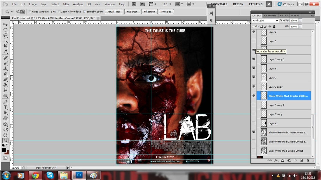
Using Photoshop

Using Photoshop was not too difficult, we had the experience from using when creating our music magazine. We used photoshop for creating our poster and magazine, we also used it to create the textual for the caption. Photoshop allowed us to use the downloaded brushes to blend the images and make backgrounds from scratch. We had to work with mixture of Photoshop tools
Shooting
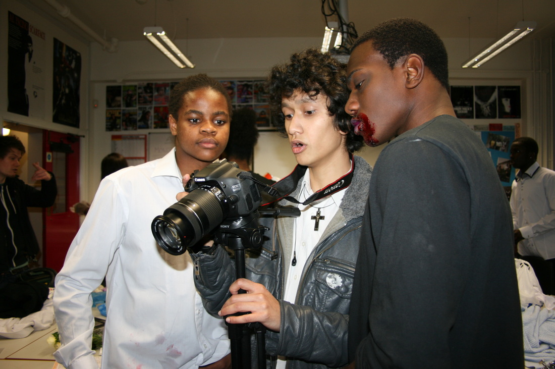
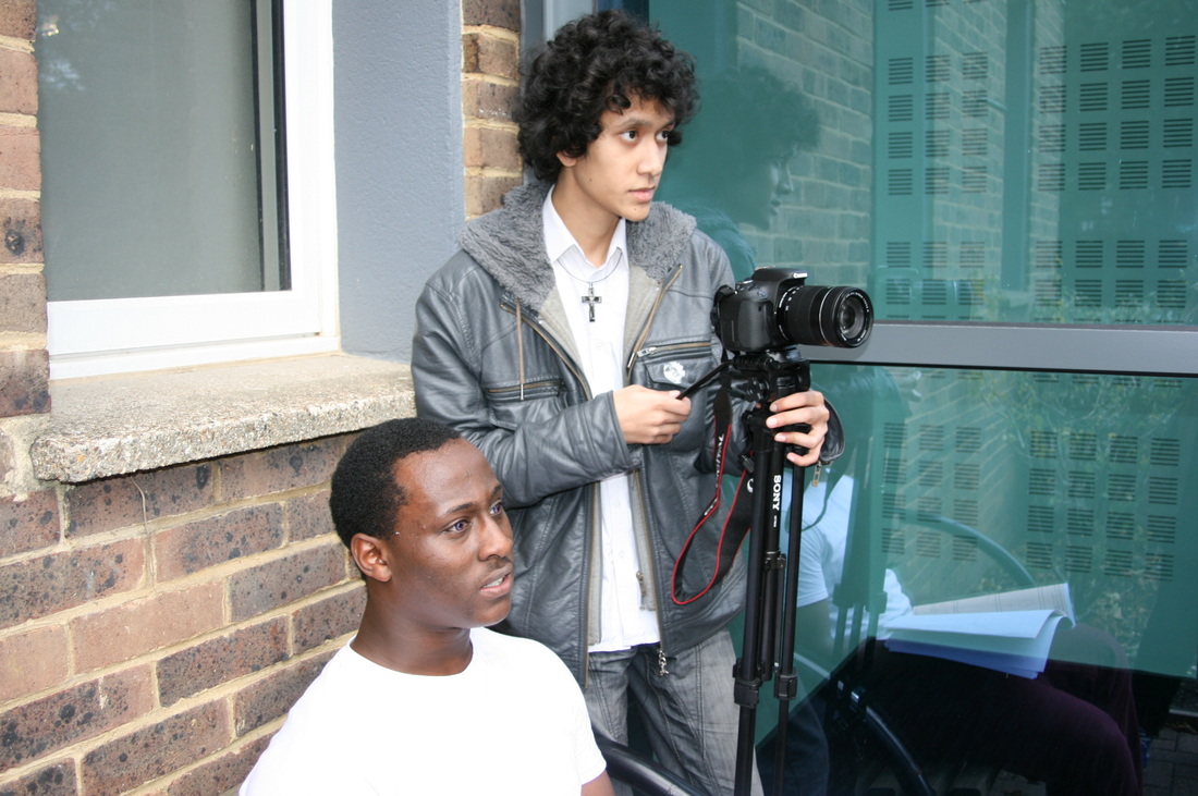
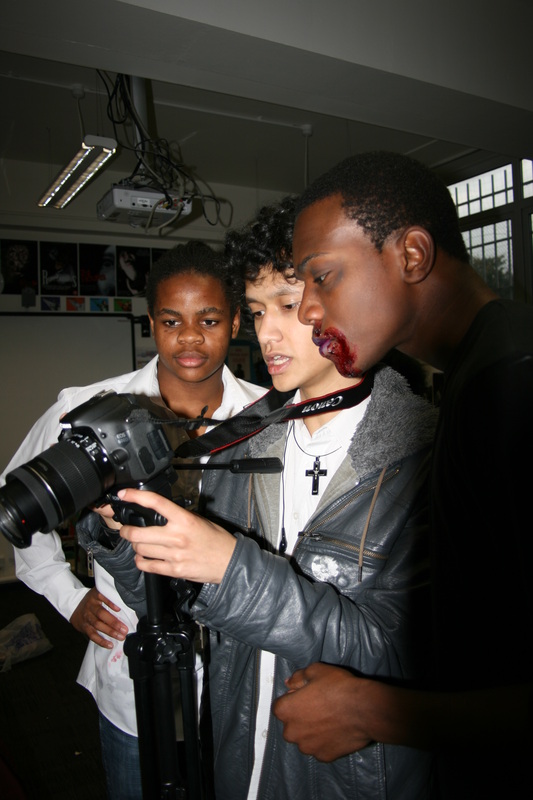
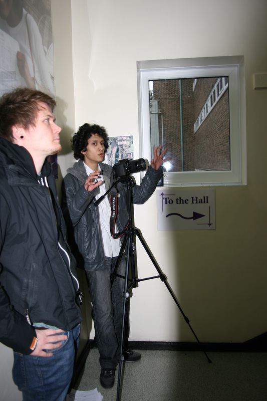
During the filming of the trailer we took some pictures to show the audience the behind the scenes. The main equipment we used is the tripod and we used this to get accurate shots and we were impressed with the shots we had.
|

|
|
|
|
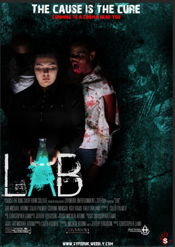
The three stages of the first poster
First Draft
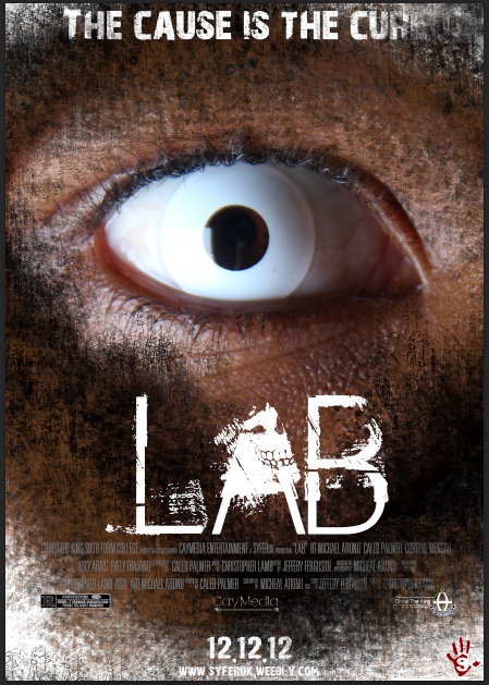
This is our first draft of the poster of the horror poster, we took an extreme close up of the model and wanted to use just the eye to show the infection caused. In the first image we downloaded a brush and used it on the corners of the poster and around the eye.
|
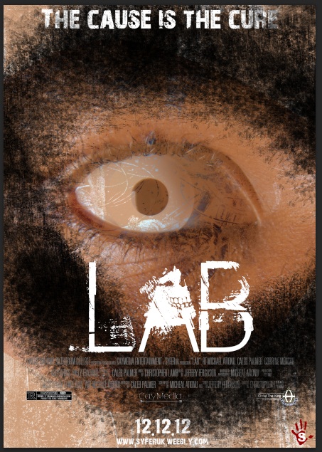
In the second try, we used the sush on the eye to make the eye
not really seen in the poster but it clearly did not work, it was just boring and would not connect to the audience. |
In the third try, we used the brush tool to darken the whole image and used the burn tool to make the skin look pealed off this face. We also did not like the yellow in the corners on the poster and took them off to make it black, which
would represent the zombies being soulless. |
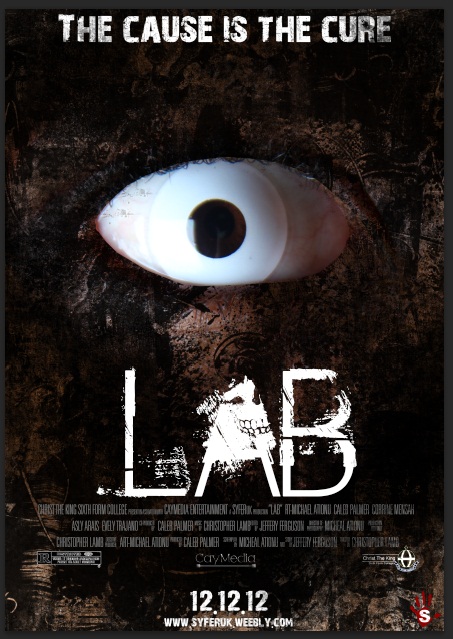
Second Draft
In the second draft we cut the image and at first the image was not cut out properly. For the background we used some downloaded brushes to make the
background look more interesting. The brushes had many varieties of slash and grunge brushes, we also decided to make the colour green so that it would be consistent with the chemical. |
We managed to blend the image into the background by using the
brushes and reducing the hardness to make the brush softer to be able to blend the image in the background. |
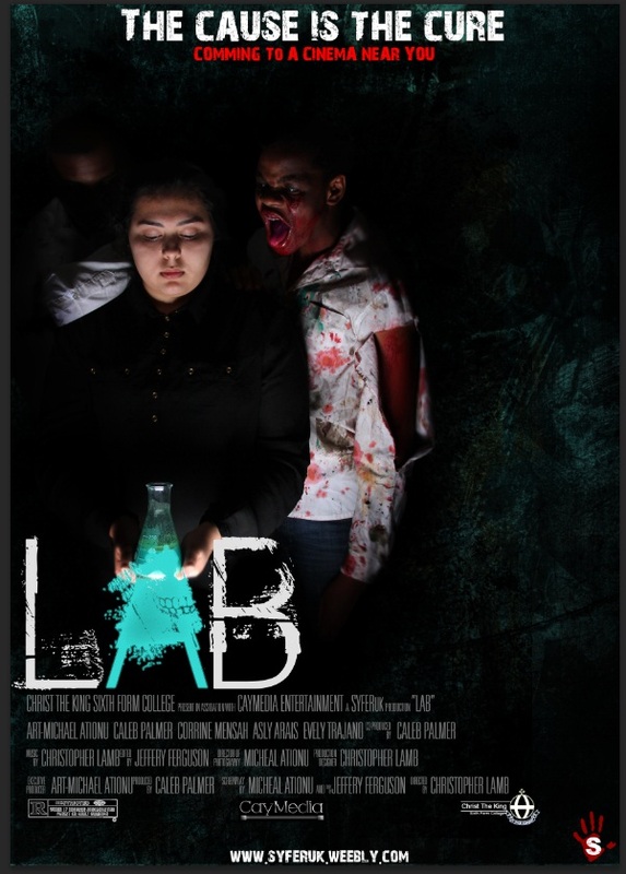
We then decided to blend the black into the background more, we used the same brush to blend it and made sure that the green could still be seen which would represent the chemical. We also decided to add a blood splatter behind the title to represent blood since we used a lot of blood make up in our trailer. The image was on the left side of the poster with didn't look professional.
|
Steps of Final Poster
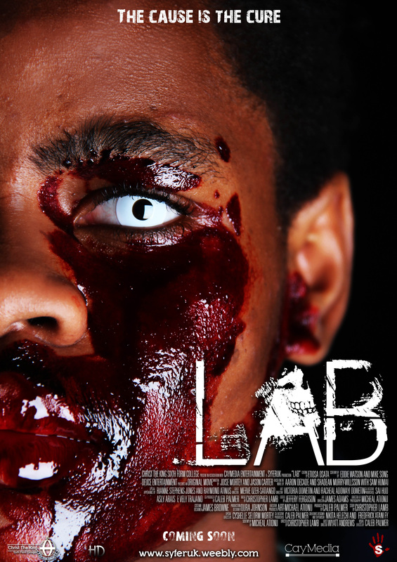
After we choose this image we decided to make the face a little smooth and we used the mixer brush tool, as you can see in the image on the right the subject has some spots on his face and we were able to use the mixer brush tool to take off the spots.
|
This image was taken during our photoshoot, after we took a varieties of pictures and different posses we decided to use this close up image showing half of the zombie's face. We wanted to use the image below to enable us to use to effects to create the blood on his face but it did not work.

|
During the creation of the we realized that the eye of the zombie looked like it was contact which it was. We then decided to make the image more interesting so that it would be more effective to the audience. We first put some brushes on the image and we reduced the opacity of the brush so that it would not be too harsh on the image, after that was done we still realized that the image would not attract the audience.

We decided that no matter what we did to the image the eye would always look amateur, so we experimented with some effects.

In the first try we downloaded an image of a cracked ground and we changed the layer options to hard light, which helped the cracks stand out more in the eye. We where still not satisfied with it because it looked amateur.
|

In this step we realized that the white in the other step was too much and the pupil in the eye could not be seen. We used the Lasso tool to make draw a shape of the eye and filled it with a dark grey colour, we then changed the layer options from normal to overlay which made the cracks more effective.
|

After the last step we duplicated the cracks and merged them together and made them smaller, with on of the cracks we changed the layer options to dissolve with gave the eye a little grainy effect. We also used the lasso tool to mark the eye and filled it with a grey colour and reduced the opacity, there was also a reflection of the light we used during the photo shoot so we used a round brush to create a black pupil to cover that.
|

The eye looked professional but it was dark and not standing out. In this step we used the brush to create a round white ball which we changed the layer options to overlay which made it brighter but it still looked like contacts so we created a curved line at the edges of the contacts and reduced the opacity and moved to the layer with the dark grey fill, we put the layer underneath the dark grey layer to help blend it more.
|
After the eye was created the image still looked boring and we used the cracks we used for the eye on the face but it did not work, we still wanted the subject to look more scary and effective to our audience.
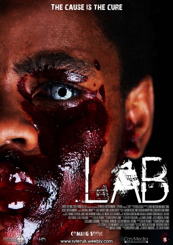
We used a brush on the subject's face and reduced the opacity and changed the layer options to overlay so that it would blend with the image more and not be too harsh.
|
We used this teabag effect on our poster which we created with different types of grunge brushes, the colours in this teabag effect are white, yellow, dark brown and grey. We applied this effect on our poster because we like the effect on existing posters such as 1408.
|

When we applied the effect we changed the layer options from normal to overlay and reduced the opacity to make it make it less bright. Just before we got the right effect for the poster we had to play around with the layer options because we did not exactly know that perfect one, Dissolve made the image too grainy, When we tried Darken it made the image more darker and less interesting, Multiply, Color Burn and Linear burn also made the image darker. Screen and Color Dodge made it too bright and unprofessional but overlay was the perfect one for the type of image.
Magazine

|
This is the image we used for our horror magazine. We made the subject put some fake blood in his mouth and he was dripping it, we also told him to make his expression emotionless just like a zombie. He also wore the contacts to show the mutation that happened in the trailer. We also did not edit the image because we added the teabag texture
|

|
|
With the masthead we used our production name. The font was plain and just red so we downloaded a grunge brush and used it on the text to make it effective, we also used the same effect on the background to make the whole magazine consistent
|

|
Creating the coverlines, we wanted the magazine to look simple but very effective to our audience. We decided to mix simple fonts and horror fonts together. "Horror Preview Special" was written in Impact font, the advert about other horror movies was also written in the Impact font. We used the font cracked for the coverlines in between the other coverlines. We used cracked to give it the effect of the text cracked which was downloaded from a font website
|

|
We had to advertise some posters on our website, we followed this from some magazines conventions. We used the rectangle tool to create a yellow bar and also created a grey bar, we then overlapped the grey bar on the yellow bar. We also made sure there was the same amount of space between the posters.
|

|

|
We wanted to be consistent with all our products, so we made sure we used the teabag effect on the magazine as well to give it the effect. When used the teabag effect we had to change the layer property to overlay so that it could blend equally on the whole magazine. We also included a frame from our trailer in the magazine to make it look more interesting and we noticed that it was very rear in the magazine industries.
Fonts

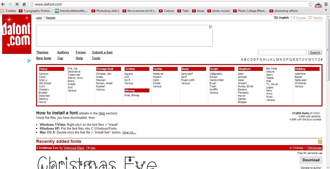
During the creation of our products, we used this website for downloading fonts. The website offered varieties of fonts with different effects and style. We also looked at other websites that offer free fonts but we found dafont easier to use.
|

We looked at 1001 free fonts, which offered free font in various varieties but also we found it a little difficult to use. We also looked at myfonts and font out that the fonts were not for free, they had really good fonts that would have been a little better than dafont.

|
|

|
|
When we were using dafont, we found it incredibly easy because it gave us options of the category we were interested in. On the website we had the chance to type in a word in a box and word appears in various types of fonts. During the search of a font to use for our productions name, we clicked on distorted on the categories and went through the whole page until we found something suitable. We also did the same when we searched for a font the suited the tittle and we looked at the category Horror, The main thing that attracted us to that font was the skull on the letter "A" which we thought would grasp our genre of horror movie.
|
We also downloaded the font for our credits, which looked very professional. Using the font was a bit complicated because in order to write actor's names the font was suppose to be in capital letters and to give credit to others such as producers, you could just press a letter and it generates it for you.
|
Sound Track Pro

We used soundtrack pro in creating our sound, This software can only be used on a mac computer, there are various types of sound already installed in the software which we used in our trailer.
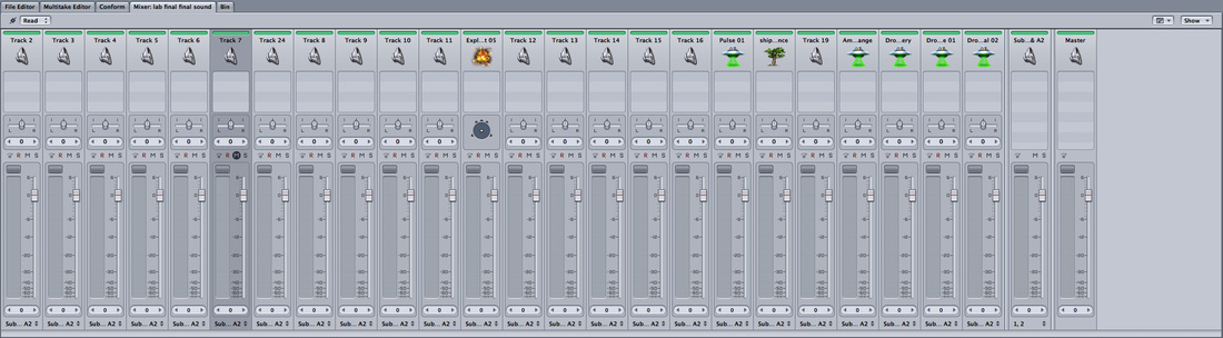
These are the volume system we used for creating our sound. There were parts that we had to mix up sounds in the Montague of the trailer and there were some sounds that were too loud and the volume had to be decreased a little in order to get the correct combination of sound.
|
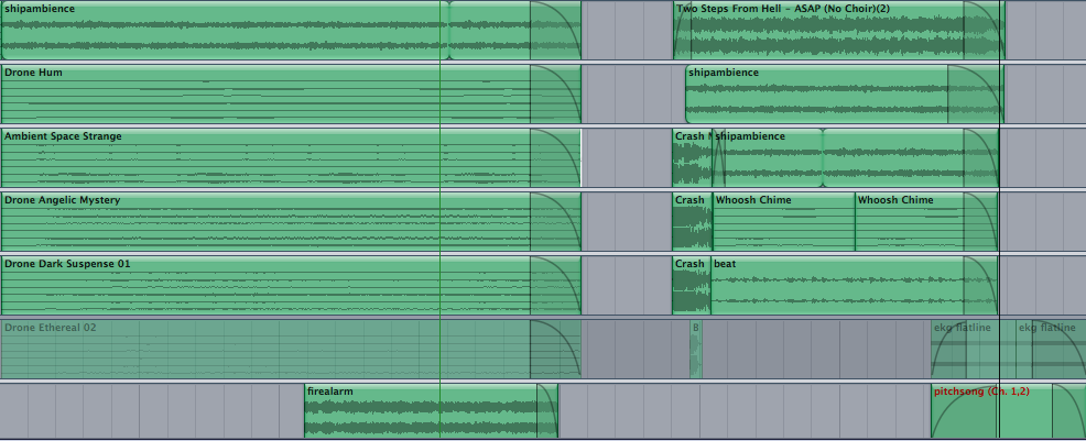
Firstly we had to import our trailer in soundtrack pro, the trailer had no sound to it. The trailer was finished before the sound and this was because we had a layout for the trailer and also a storyboard as guidance but for the sound we did not have any guidance we just had to use a best sound we got from the software.

This is the main time line and as you can see it consists the names of the sound we used for example crush was the sound used when the rebel students missed the catch and the bottle dropped. There is also a curve on some of the bars, the curves are for when we want the sound to fade into silence.
|
Final Cut Pro
|
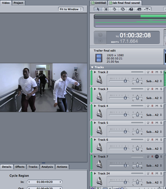
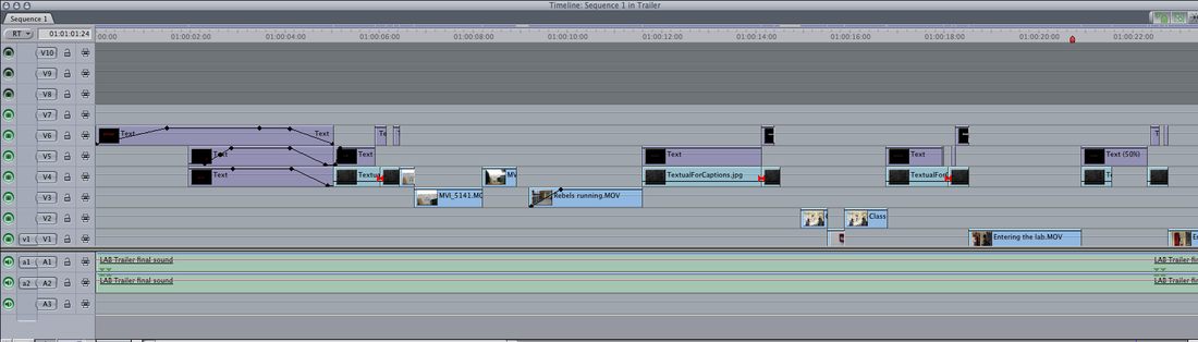
Final Cut pro is the software we used in creating our trailer, we also used it to create our animatic and photo animatic. We were new to this software when we started the project.

|
When we imported the shots into the final cut project we had to group them first and rename them to be very organized. The shots where all in this tab and if there was a shot that is missing there would be a red line across it.

This is the time line we used and as you can see, their are some lines on some of the shots, this was to make the shot fade out or in.
|
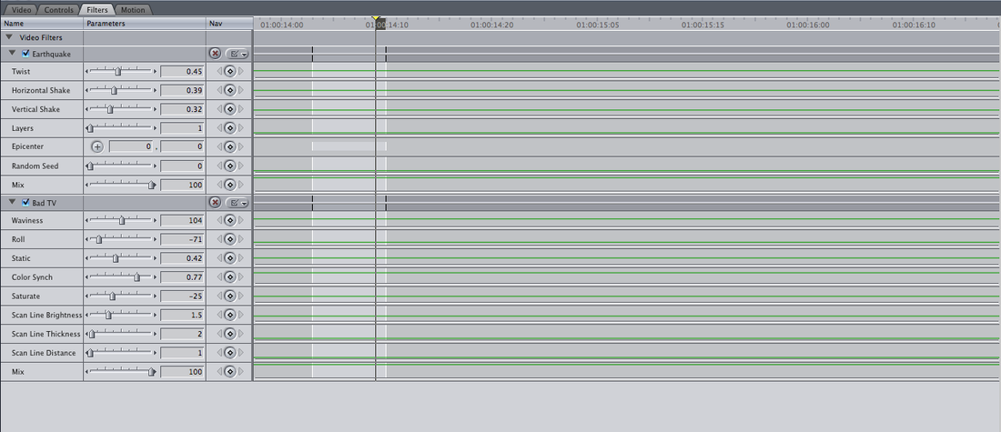
When we saw the footage of the trailer, we had to use some effects on the footage and desaturated it to make it look more effective because it was sharp and it didn't have the horror effect on it. We used the controls to change the colour of the footage and also we sued earthquakes when we wanted the footage to shake, we used bad TV effect when we wanted the footage to cut into half and give it a glitch effect. We used these effect through out our trailer.

To make the text move on the screen, we had to go to control and made sure it was centered from where we wanted it to move from, we also had to drag it along the screen to make the text move. We had to keep the speed between the captions consistent. In order to move the captions, we had to import the textual for the captions into final cut and downloaded the font for the caption in order to access it in final cut and also to enable us to do create the glitches.

|
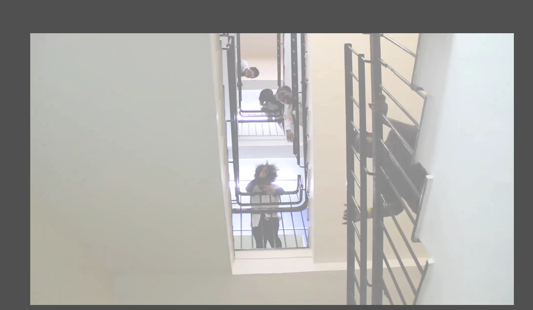
We also used other effects such as wash. It is when the shot fades into white and this was used when the zombies where on the stairs this scene was inspired by the same scene in rec.
The glitches we did on the captions were to make them glitch and disappear. We did this by using the earthquake to make it shake and using rolls from controls to position them, we stretched it to make it difficult to read.


We used these tools in creating our trailer. We used the pen tool when wanted to fade any shot, we used the arrow to move the shots around and decrease the length of it. We used the blade tool to cut up the shots, we cut up the Captions word to create the glitches on the cut up ones. In the trailer wherever there is a normal shot and it glitches, we had to use a blade to enable this action. We also used the zoom icon to zoom in and out of the time line, we usually zoom in when we wanted to put the shots together and whenever we were cutting up the
trailer to make sure we put it in the specific place. |
These are all the technologies we used in creating our poster, magazine, sound and trailer. Even though we could not use some of them during the process, we spent sometime with the softwares and got use to it. Creating the trailer took the longest time and we had to make changes almost every week but the poster did not take as much time to create as we were used to Photoshop.
